One structure, four products
For the "Ti cambia la vita" campaign, I designed a landing page system where each product has its own colour and message, but all of them share the same structure.
- My role
- UX/UI design, hero and animation
- Market
- Italy
- Products
- Joya · Starla · Sofia · All Seasons
- Tools
- Figma · HTML, CSS and JS
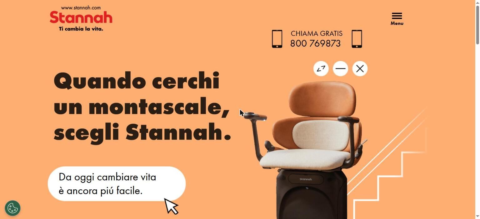
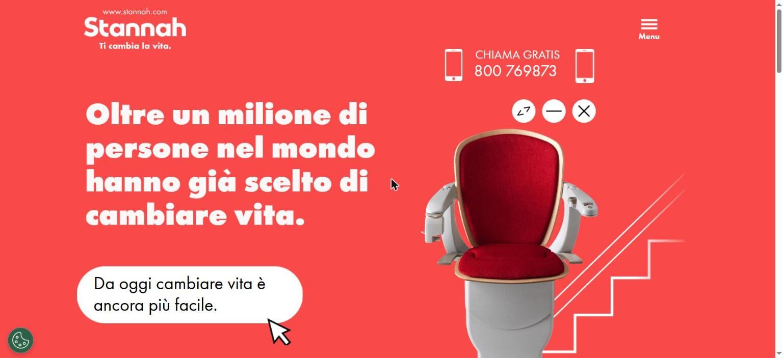
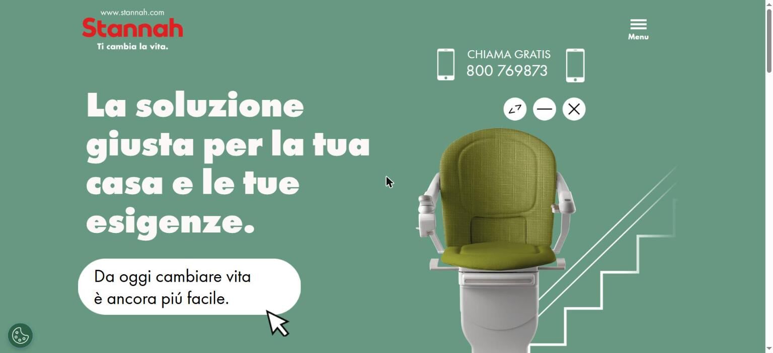
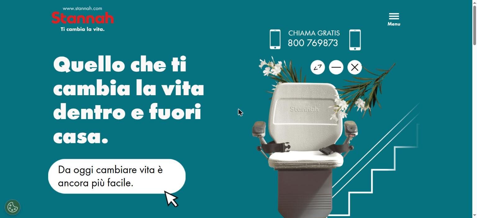
Four products, four different messages and one campaign. Each page had to be recognisable as part of the set.
A single template with fixed and variable parts: the structure stays the same; the colour, headline and product change.
Four consistent landing pages, faster to produce and maintain, and comparable with each other.
Context
The "Ti cambia la vita" ("It changes your life") campaign featured four Stannah stairlifts, each with its own argument. Every ad led to a landing page dedicated to the product and message the person had just seen.
The risk of building four independent pages was clear: four different ways of telling the same story, more work for every change, and results that were hard to compare.
Four messages
Each page speaks to a different motivation of people looking for a stairlift:
Quando cerchi un montascale, scegli Stannah.
Joya: "When you're looking for a stairlift, choose Stannah." The reference brand.Oltre un milione di persone nel mondo hanno già scelto di cambiare vita.
Starla: "Over a million people worldwide have already chosen to change their lives." Social proof and trust.La soluzione giusta per la tua casa e le tue esigenze.
Sofia: "The right solution for your home and your needs." Fit for each home and person.Quello che ti cambia la vita dentro e fuori casa.
All Seasons: "What changes your life, inside and outside the home." Outdoor use too.
The system
Before designing any page, I separated what had to be the same everywhere from what could change. That split became the rule for the template.
Fixed on every page
- Grid and order of sections
- Logo and "Ti cambia la vita" tagline
- Free phone number always visible
- "Da oggi cambiare vita è ancora più facile" speech bubble
- Line illustration of the staircase
Variable per product
- Background colour
- Headline and message
- Product photo
- Headline animation in the hero
Design decisions
One strong colour per product
Orange, red, green and teal. The colour identifies the product at a glance and connects the page to the ad the person just saw. Within each page, the palette stays short so the product stands out.
A big, animated headline in the hero
The message is the first thing on the page, in heavy type with an entrance animation. People arriving from an ad immediately recognise the same promise.
The product as the star
The stairlift is cut out, with no background, next to the line-drawn staircase. The composition is the same on all four pages, so only what matters changes: the product.
Contact always at hand
The free phone number sits at the top of every page. For this audience, calling is still one of the preferred ways to ask for information.
The pages
Result and learnings
- Deciding first what's fixed and what's variable turns every new page into a content question, not a design one.
- With the same structure on all four pages, differences in results come from the message and the product, not the layout. That makes the pages comparable.
- Colour is the fastest way to give each product its own identity without breaking the consistency of the campaign.